Get Four Column Chart Form in PDF
The Four Column Chart form is a versatile tool designed to help individuals and organizations organize their thoughts and ideas in a structured manner. This form typically features four distinct columns, each serving a specific purpose, which allows users to break down complex topics into manageable sections. By writing headings for each column, users can clarify their focus and ensure that all relevant information is included. The form encourages detailed entries, prompting users to fill in each column with pertinent details related to the chosen topic. Whether it's for brainstorming, project planning, or summarizing information, the Four Column Chart form can streamline the process and enhance understanding. The simplicity of this format makes it accessible for everyone, from students to professionals, ensuring that valuable insights are captured effectively. In essence, the Four Column Chart is not just a form; it's a pathway to clearer thinking and better organization.
Misconceptions
The Four Column Chart form is a useful tool for organizing information. However, several misconceptions exist regarding its use and functionality. Below is a list of common misunderstandings.
- Misconception 1: The Four Column Chart can only be used for business-related topics.
- Misconception 2: Each column must contain the same type of information.
- Misconception 3: The Four Column Chart is complicated to fill out.
- Misconception 4: You must fill out all columns for it to be effective.
- Misconception 5: The Four Column Chart is only beneficial for group projects.
- Misconception 6: The chart is outdated and not relevant today.
- Misconception 7: You cannot modify the Four Column Chart to fit your needs.
This is not true. The Four Column Chart is versatile and can be applied to various subjects, including education, personal projects, and more.
This is incorrect. Each column can represent different categories of information, allowing for a more comprehensive view of the topic.
Many find the chart straightforward. It requires simply writing headings and details, making it easy to use.
While filling out all columns can enhance clarity, it is not mandatory. Users can leave columns blank if the information is not applicable.
This form can also be beneficial for individual use. It helps organize thoughts and ideas, regardless of whether it's a group or solo effort.
On the contrary, the Four Column Chart remains a popular organizational tool. Its simplicity and effectiveness keep it relevant in various fields.
In fact, users are encouraged to customize the chart. Adjusting headings and details can enhance its usefulness for specific projects.
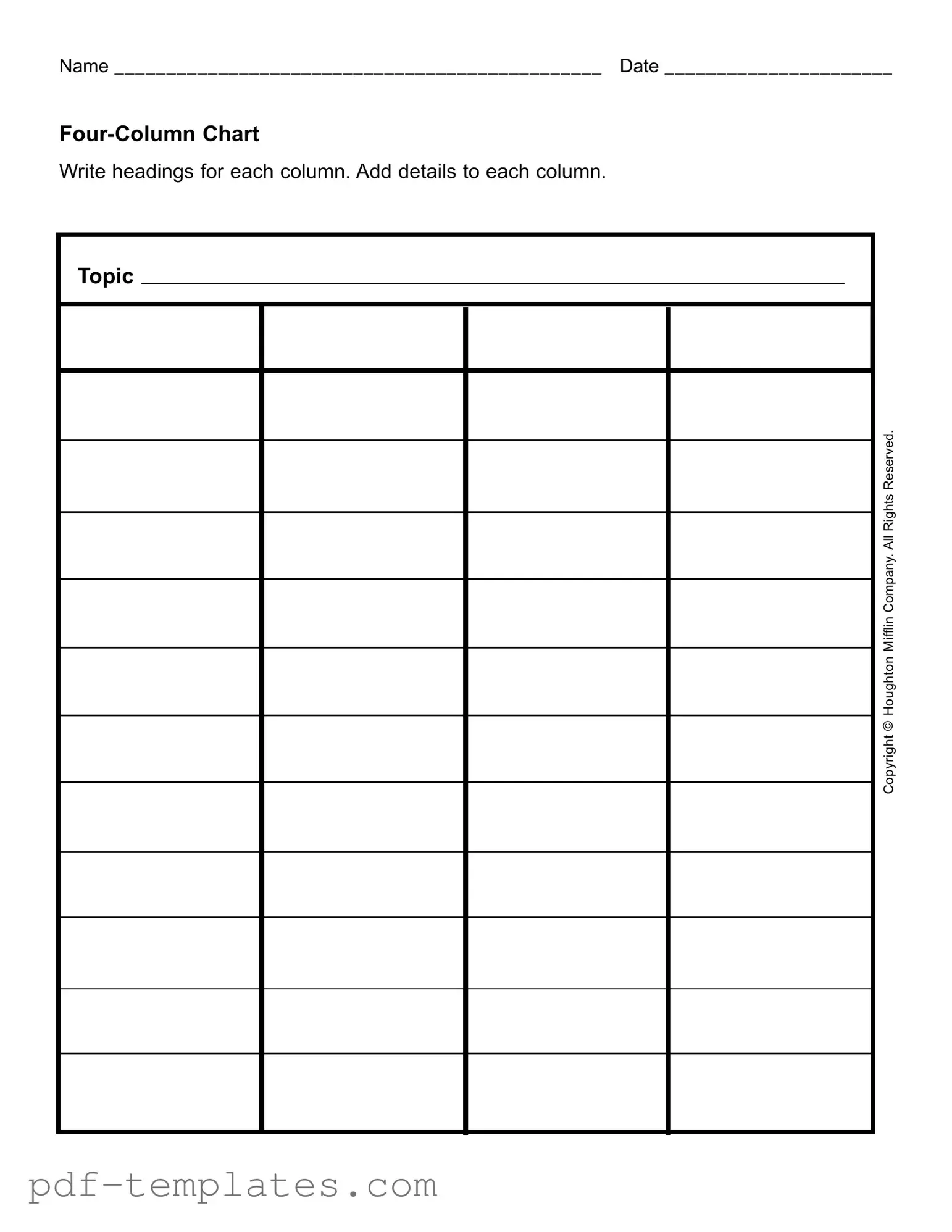
Four Column Chart: Usage Instruction
Completing the Four Column Chart form is a straightforward process that helps organize information effectively. By following these steps, you will be able to fill out the form accurately and efficiently.
- Begin by writing your name in the space provided at the top of the form.
- Next, enter the date on which you are filling out the form.
- Label each of the four columns with appropriate headings that reflect the information you will include.
- In the first column, add relevant details related to your chosen topic.
- Continue by filling in the second column with additional information that complements the first column.
- In the third column, provide further details or examples that support the information in the previous columns.
- Finally, complete the fourth column with any concluding thoughts or summaries that tie together the information presented.
Common mistakes
-
Neglecting to Write Clear Headings: One common mistake is failing to create distinct and informative headings for each column. Without clear headings, it becomes challenging to understand the content at a glance.
-
Omitting Important Details: Some individuals do not include all necessary information in the columns. Each column should be filled with relevant details to provide a comprehensive overview of the topic.
-
Inconsistent Formatting: Using different formats for text within the same column can confuse readers. Consistency in font size, style, and bullet points is essential for clarity.
-
Overloading Columns with Information: Another frequent error is cramming too much information into a single column. This can overwhelm the reader and obscure key points.
-
Ignoring the Date Field: Many people overlook the importance of filling out the date field. Including the date provides context and helps track when the information was compiled.
-
Failing to Review Before Submission: Finally, not reviewing the completed chart can lead to errors. A quick review can catch mistakes and ensure that the chart effectively communicates the intended message.
File Specifics
| Fact Name | Description | Governing Law | Notes |
|---|---|---|---|
| Purpose | The Four Column Chart is used for organizing information in a structured format. | Not state-specific; commonly used in various contexts. | Facilitates comparison and analysis of data. |
| Structure | Consists of four columns, each designated for specific types of information. | Not governed by specific laws; widely accepted in educational and professional settings. | Columns can be labeled according to the user's needs. |
| Applications | Used in business, education, and legal settings for clarity and organization. | Varies by application; no single governing law. | Effective for presentations and reports. |
| Customization | Users can modify the headings and content to fit their requirements. | No specific regulations; flexibility is encouraged. | Adaptable to various topics and fields. |
| Accessibility | Can be created in various formats, including digital and print. | Not subject to specific laws; accessibility standards may apply. | Ensure compatibility with different devices and platforms. |
Dos and Don'ts
When filling out the Four Column Chart form, it's important to keep a few things in mind. Here are some dos and don'ts to help you complete the form effectively.
- Do write clearly and legibly. This ensures that your information is easily readable.
- Do label each column with appropriate headings. This helps organize your details better.
- Do keep your information concise. Stick to the main points to avoid clutter.
- Do review your entries before submitting. A quick check can catch any mistakes.
- Don't leave any columns blank. Fill in all sections to provide complete information.
- Don't use complicated language. Simple words are easier to understand.
- Don't overcrowd the chart with too much information. Focus on key details.
- Don't forget to include your name and date. These are essential for identification.
Similar forms
The Four Column Chart form shares similarities with the SWOT analysis document. Both tools are designed to organize information clearly and concisely. In a SWOT analysis, individuals identify strengths, weaknesses, opportunities, and threats related to a specific topic or business. Similarly, the Four Column Chart allows users to categorize details under four headings, facilitating a structured approach to understanding a subject. This organization helps in visualizing key points effectively.
The Fishbone diagram, also known as the Ishikawa diagram, is another document that resembles the Four Column Chart. Both are used to analyze problems or processes. The Fishbone diagram visually represents potential causes of an issue, while the Four Column Chart allows for a straightforward listing of details under specific headings. Both formats help users identify relationships between different elements, making it easier to pinpoint areas for improvement.
Mind maps are another tool similar to the Four Column Chart. They provide a visual representation of ideas and concepts, allowing for a free-flowing exploration of a topic. While a mind map branches out from a central idea, the Four Column Chart organizes information into distinct columns. Both methods encourage brainstorming and can lead to a deeper understanding of a subject by breaking it down into manageable parts.
The Venn diagram also shares characteristics with the Four Column Chart. Venn diagrams illustrate relationships between different groups or concepts through overlapping circles. In contrast, the Four Column Chart organizes information into separate columns, but both formats help clarify relationships and distinctions among various elements. This visual representation aids in comparing and contrasting different aspects of a topic.
Flowcharts are another document that bears resemblance to the Four Column Chart. Flowcharts depict processes or workflows in a sequential manner. They guide users through steps or decisions, similar to how the Four Column Chart organizes information into structured categories. Both tools enhance understanding by presenting information in a clear, visual format that can simplify complex ideas.
Checklists also share similarities with the Four Column Chart. Both documents serve as organizational tools that help ensure all necessary information is considered. A checklist allows users to tick off items as they are completed, while the Four Column Chart organizes details under headings for easy reference. Both formats promote thoroughness and can be useful in planning or evaluating tasks.
When dealing with property transactions, understanding the necessary documentation is crucial. For instance, a California Quitclaim Deed form is a legal document used to transfer interest in real estate from one person to another, typically without any warranties regarding the title of the property. This makes it significantly different from other forms of property deeds that guarantee the status of the property's title. It's commonly used among family members or to resolve title issues, providing a swift way to manage property transfers under specific circumstances. For more information, you can refer to All California Forms.
Project management templates can be compared to the Four Column Chart as well. Both tools help in organizing information related to specific projects. A project management template typically includes sections for tasks, deadlines, and responsibilities. The Four Column Chart, while more focused on categorization, also helps in organizing details relevant to a topic or project, facilitating better planning and execution.
Lastly, the Gantt chart is similar to the Four Column Chart in its organizational approach. Gantt charts visually represent project timelines and tasks, showing how different elements relate to one another over time. While the Four Column Chart organizes information into columns, both tools serve to clarify relationships and timelines, aiding in project planning and management.
Other PDF Forms
Roof Report Template - Record any stains found on the exterior walls.
Lien Release Requirements by State - Involves strict compliance with state laws and deadlines.
For those looking to facilitate the transfer of ownership for their recreational vehicle, the Texas RV Bill of Sale is an essential tool. This legal document not only protects both parties in the transaction but also provides the necessary details that can help avoid misunderstandings. To access a template for this important paperwork, you can visit documentonline.org/blank-texas-rv-bill-of-sale, ensuring that you have the right form to make your RV purchase or sale as seamless as possible.
How to Check How Many College Credits You Have - Emergency requests may be accommodated through direct contact with the registrar.